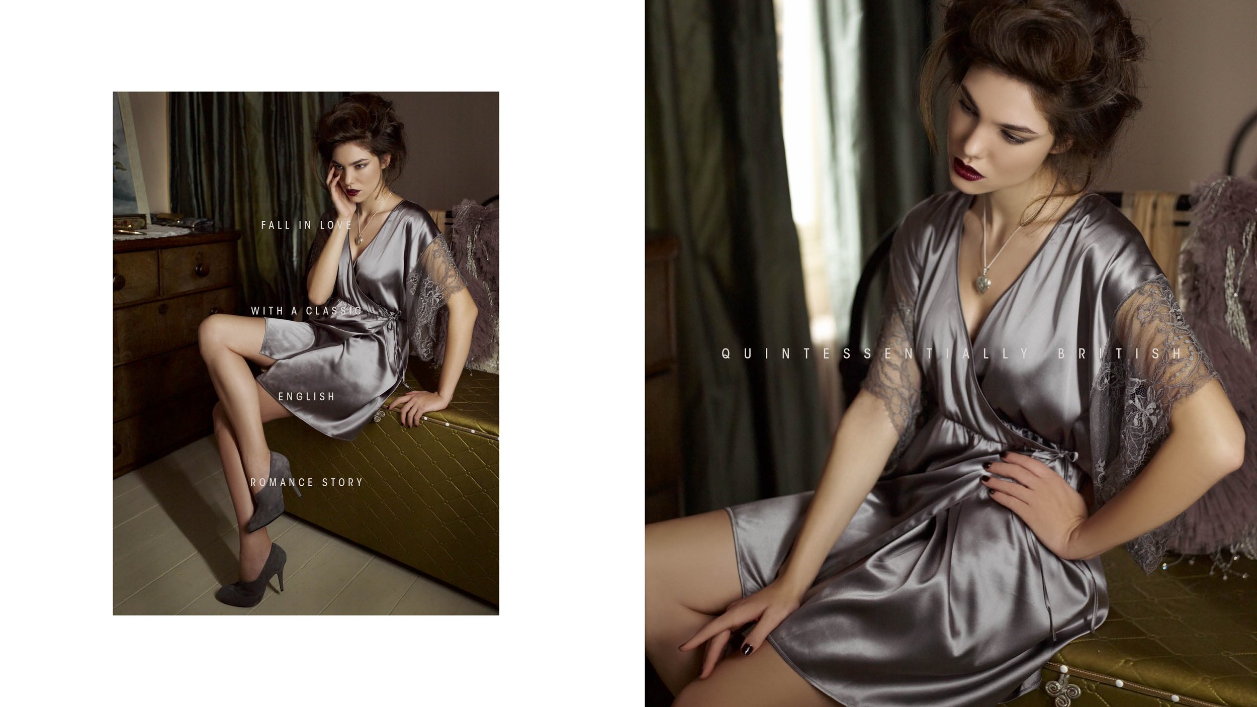
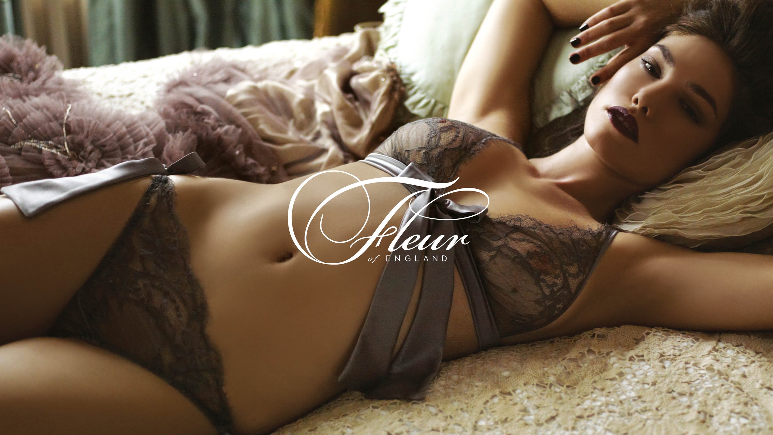
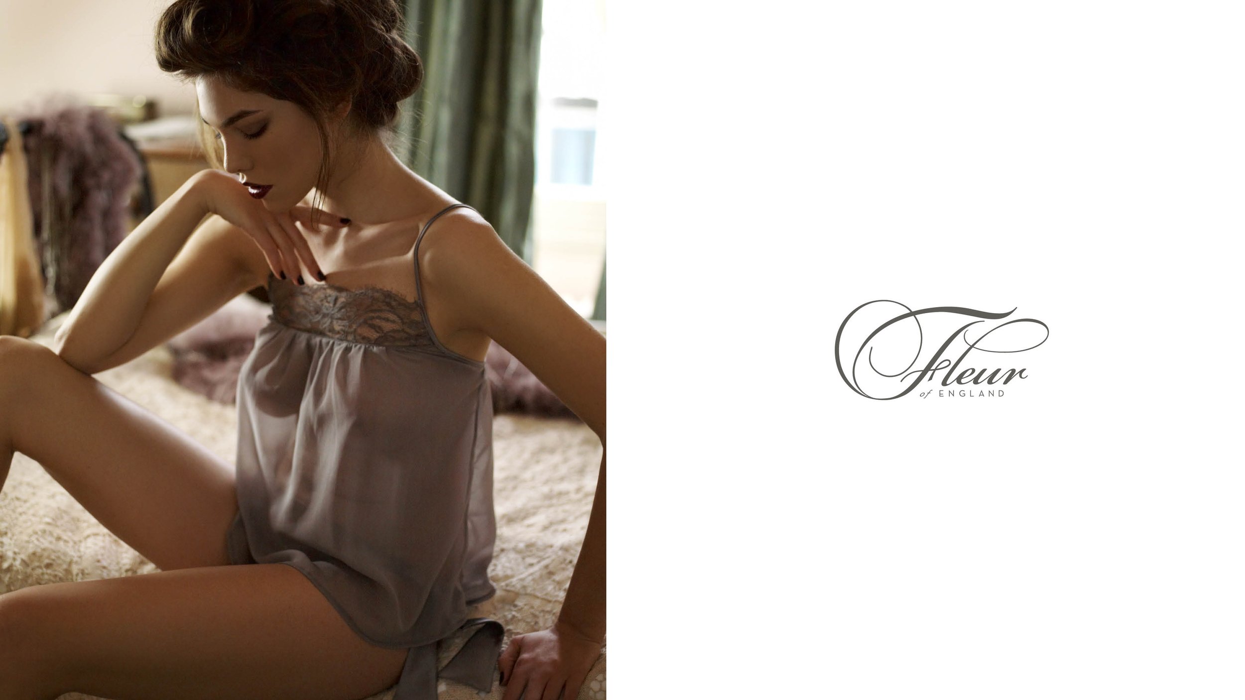
Fleur of England
Quintessentially British
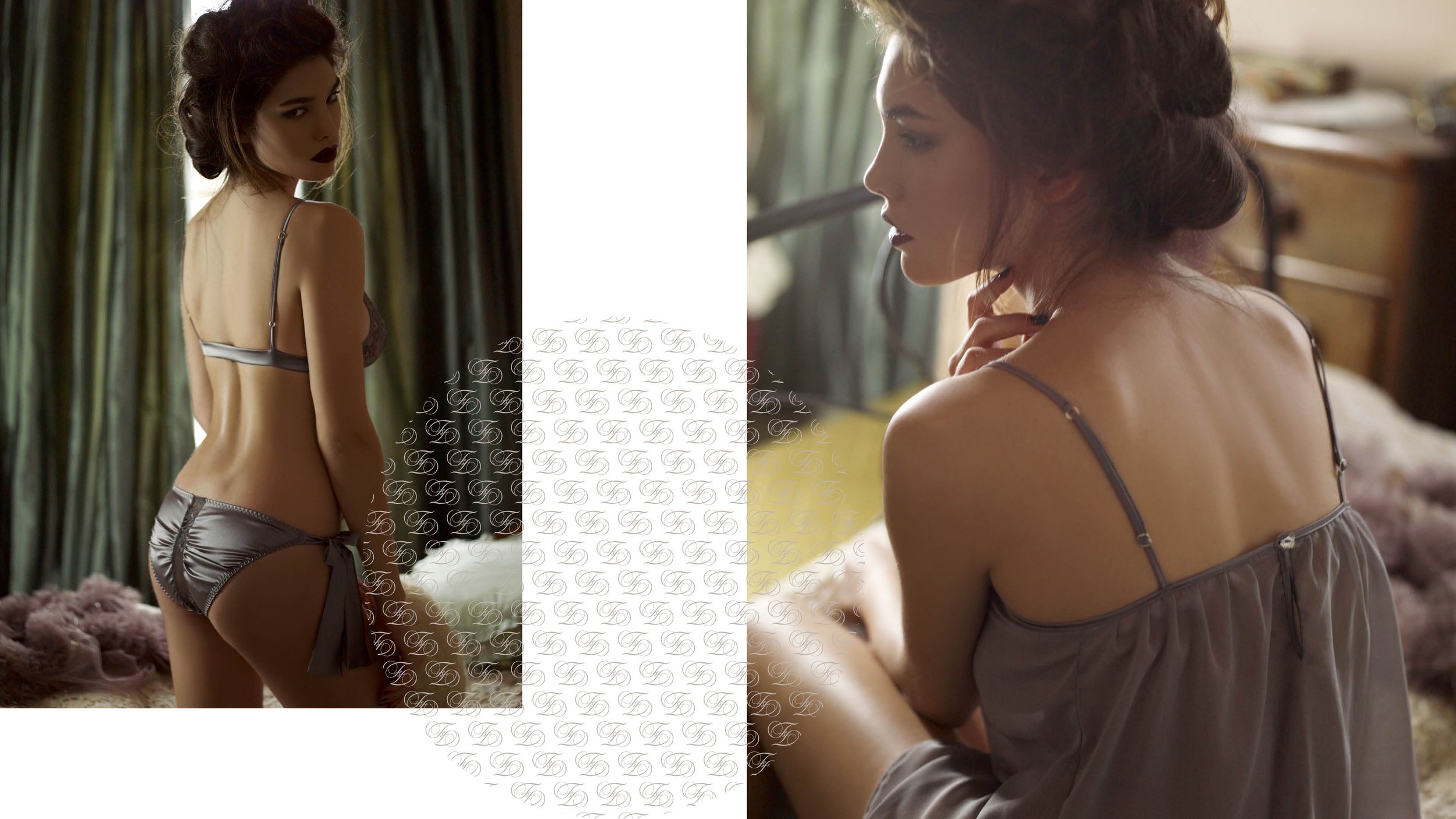
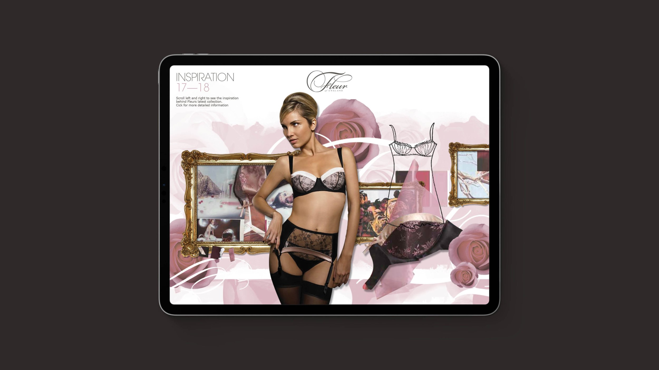
Rebrand of luxury British lingerie label producing unique and beautiful designer lingerie in silk and lace.

The aim was to strengthen the brand’s English heritage, giving it a clear position in both its UK and overseas markets where it is sold through a selection of lingerie boutiques.


The finished result is delicately crafted typography which aims to enhance the femininity of the brand and represent the attention to detail and care that goes into every Fleur of England product.


Winner of best Corporate Identity at Cream Yorkshire.