Honley Day Care
A delightfully playful identity
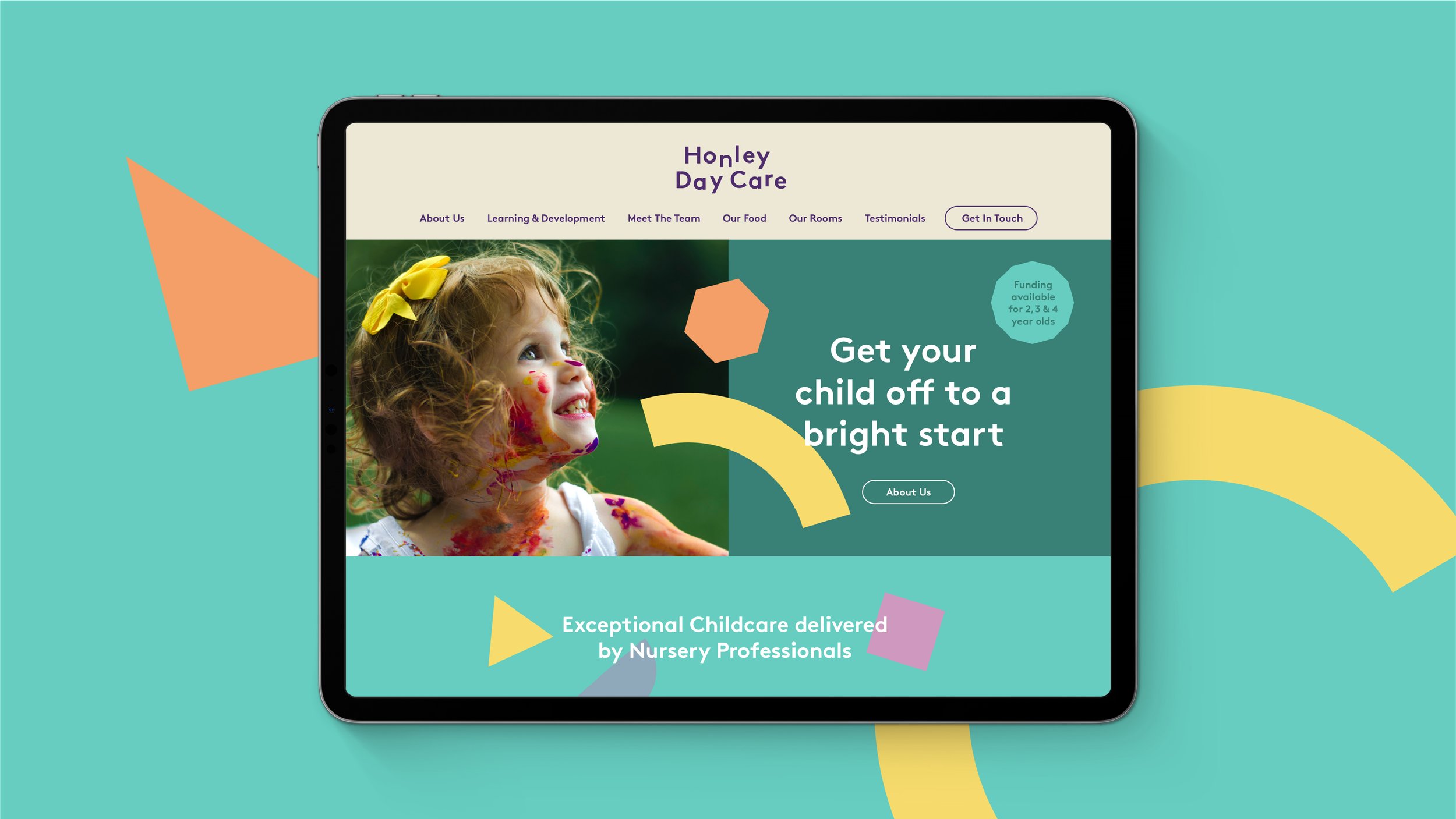
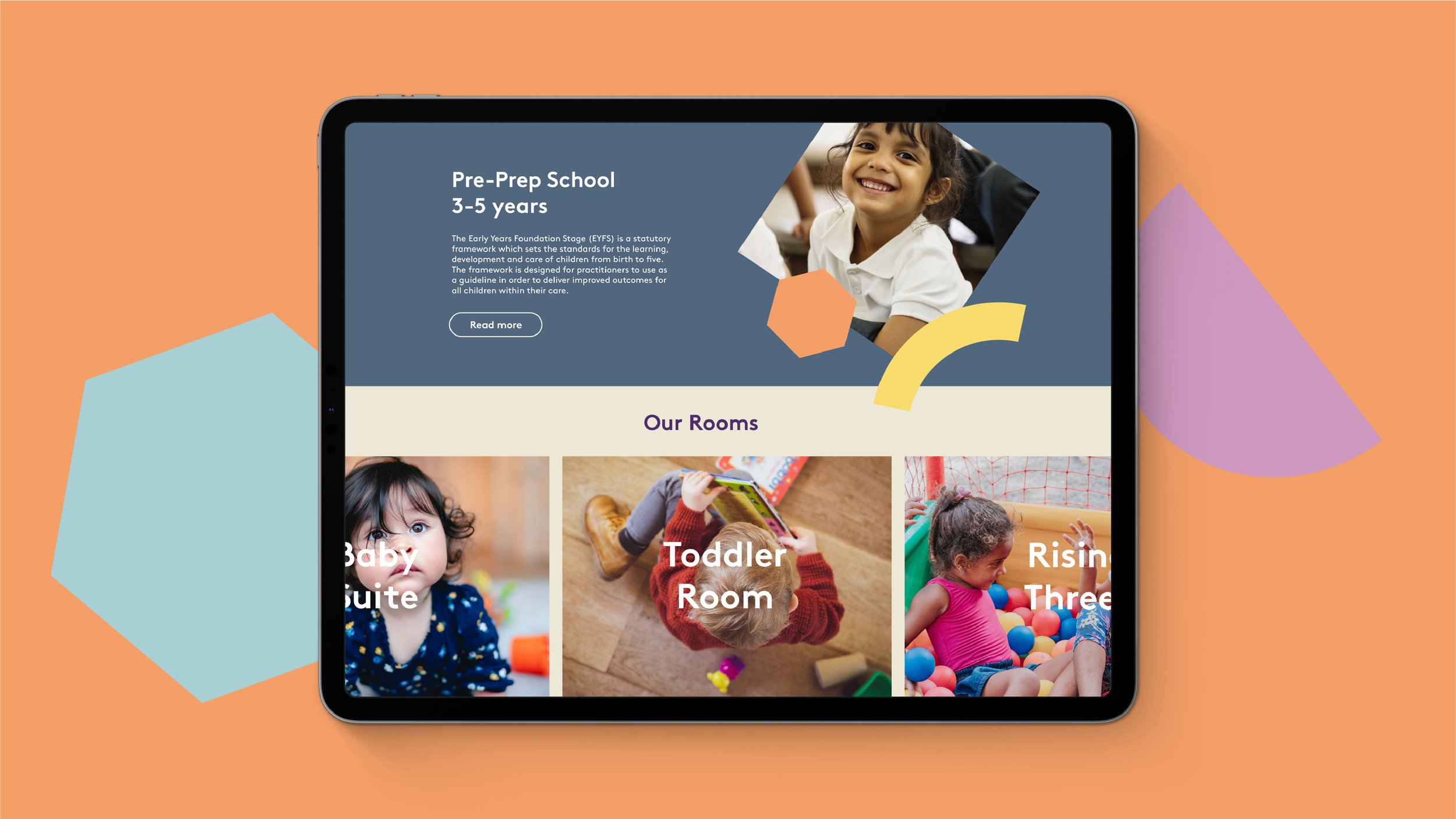
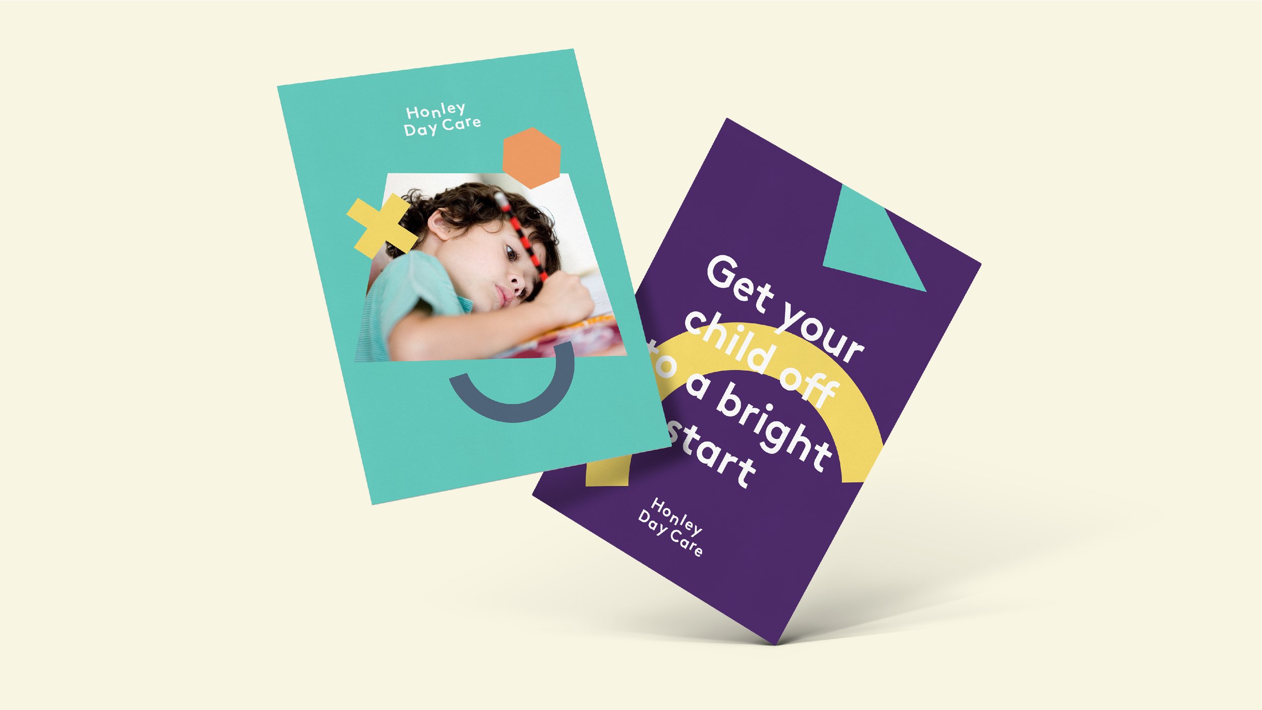
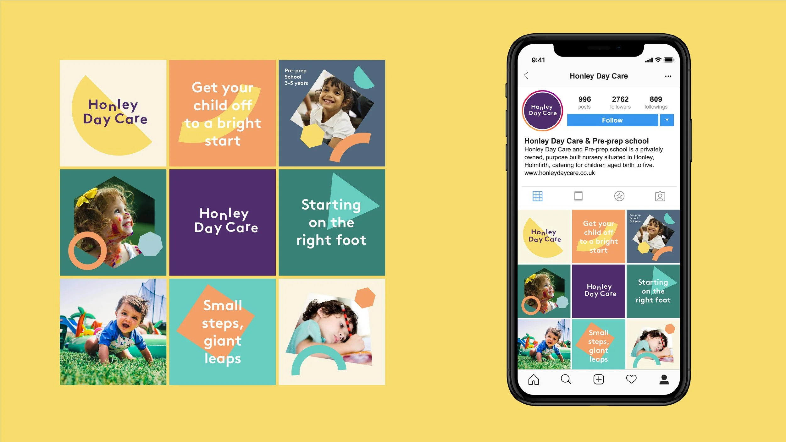
The Honley Day Care brief was to develop the existing branding, in order to freshen and update the image of the business.
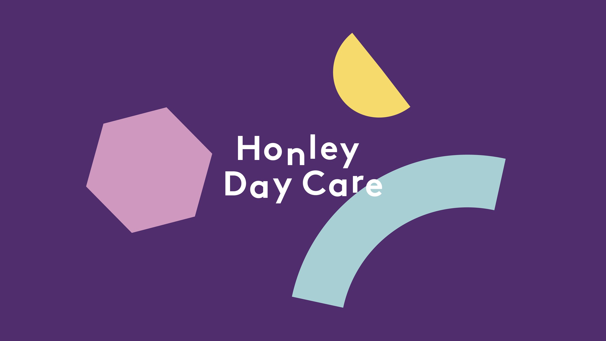


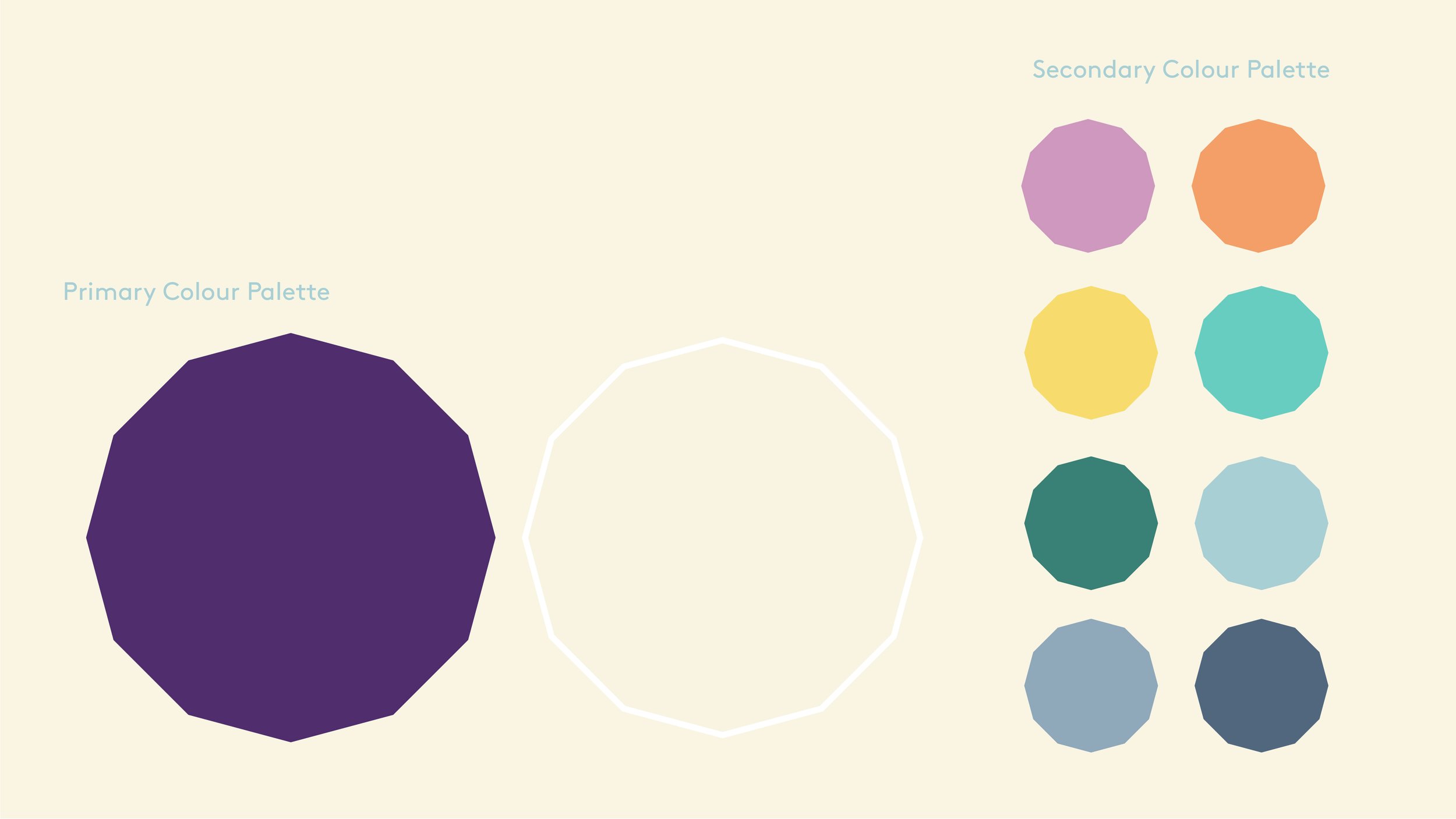
The brand identity incorporates a new colour palette, along with a set of geometric shapes that symbolise education, building blocks that play an important function in the overall brand toolkit.


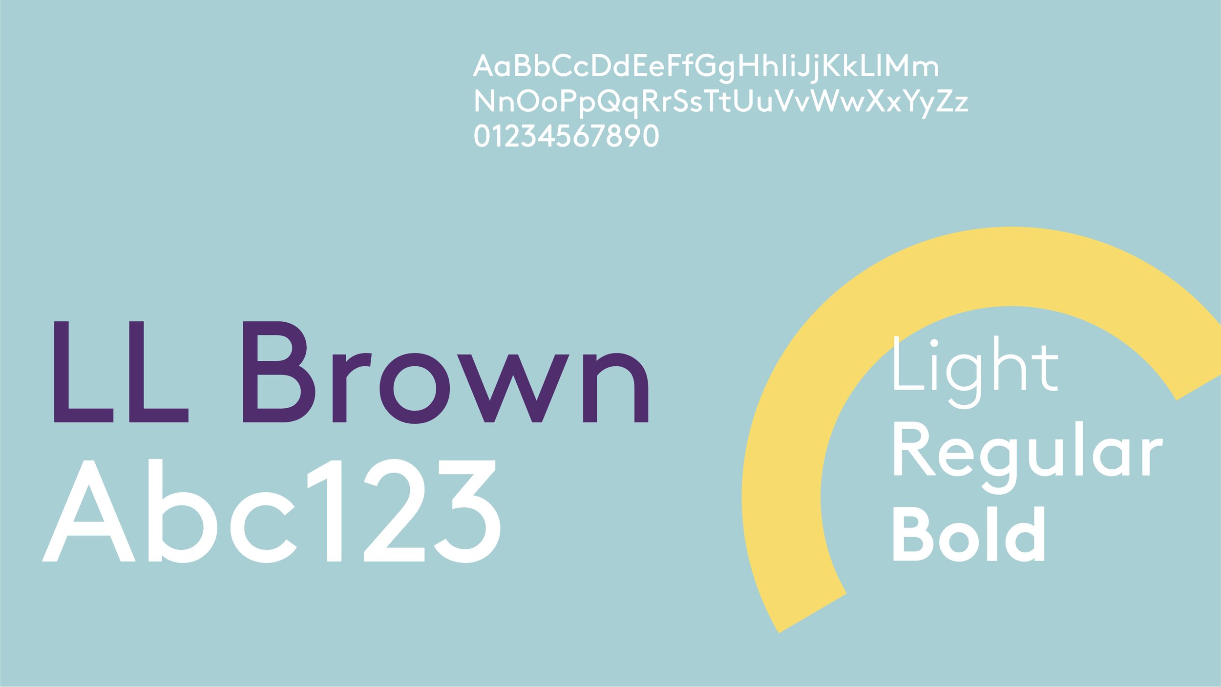


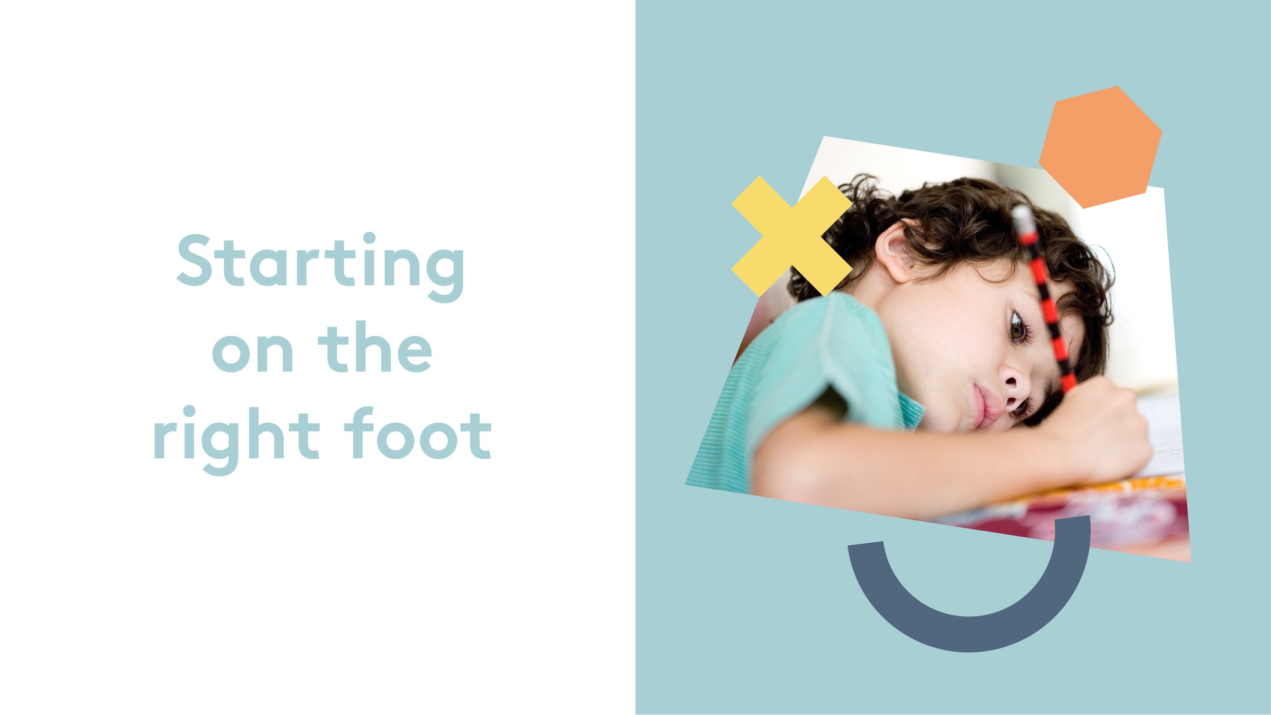
The typography is clean and legible but has a delightfully playful styling. Finally, a layer of photography helps to depict the various children's activities and the joy of thriving in a great educational early years environment.